A poem’s words are only part of the print file. Its line endings, spaces between stanzas and agreed credit can also carry meaning. Keep those choices visible from the source text through the final layout.
Preserve the poem before making it fit
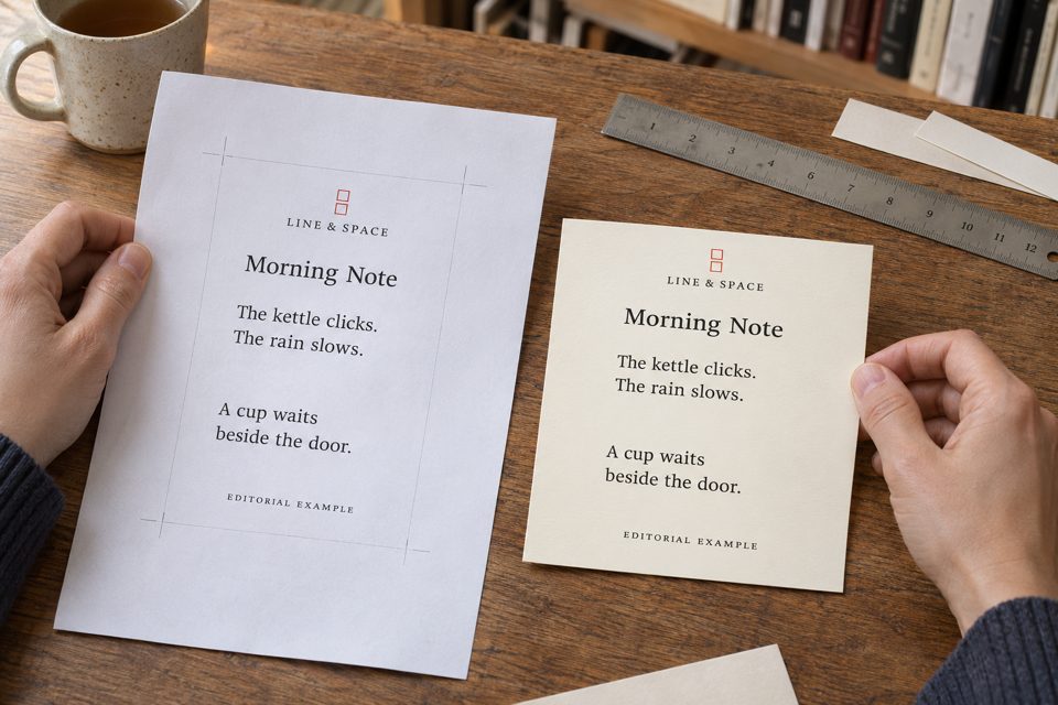
Keep an agreed source version that shows the title, every intended line ending, stanza gaps, punctuation and credit. Compare the print layout against that version before approving it. If a line does not fit the chosen format, review the layout or format rather than silently rewriting the poem.
Here is a complete poem newly written for this article. It has four intended lines arranged in two stanzas:
Morning Note
The kettle clicks.
The rain slows.
A cup waits
beside the door.
Editorial example written for this guide.
The first stanza contains two complete statements about sound and weather. The second carries its sentence over a line ending. The Academy of American Poets calls that continuation enjambment. In this example, the brief line “A cup waits” holds attention on the cup before the next line gives its location.
The Harvard guide to poetic terms describes a stanza as a group of lines separated from other groups by extra space. Here, that gap gives a visible separation between the first two observations and the waiting cup. It is one deliberate layout choice, not a universal rule for how every reader must pause.
A flattened version would read: “The kettle clicks. The rain slows. A cup waits beside the door.” The words survive, but the two-stanza arrangement and the chosen break after “waits” do not. Turning a poem into a paragraph is a textual change, even when no word is missing.
If you are still creating the piece, first write and revise a short object poem. Once the writer has chosen a version, typesetting should preserve that version unless a change is agreed.
Give the designer one source and clear instructions
For a small bookshop card, the following complete fictional brief is more useful than “make it look poetic”:
Line & Space layout brief — Morning Note, version 1
Use the source text shown above. Keep the title, four line endings, the larger gap between the two stanzas, both full stops in stanza one and the full stop after “door.” Do not add punctuation after “waits.”
Keep the credit “Editorial example written for this guide” in the text record. The illustrated artwork uses the shorter agreed display credit “EDITORIAL EXAMPLE.” For a real writer, use that writer’s agreed name and credit instead.
Prepare a 4 × 6 inch portrait layout using the provider’s actual template for that selected format. If the text does not fit comfortably, show a revised layout or a larger format before changing any line ending. Return a versioned proof that can be compared with this source.
Use your own work or a piece whose reproduction you have arranged. Keep the agreed use and credit with the source file. A poem found on a webpage is not automatically the text to place into a customer’s print order.
Worked correction: suppose proof 1 merges “A cup waits” and “beside the door.” into one line, removes the stanza gap and substitutes the shop name for the credit. Mark those three differences against the source. Request restoration of the two original lines, the gap and the agreed credit, then check the returned proof again. “Looks fine” is not a record of which text version was approved.
If the writer chooses a new arrangement, save it as a new source version and compare the next layout with that version. Keep the earlier file so the change is understandable. Do not allow a chain of screenshots and messages to become several competing “final” poems.
Check size and wrapping without changing the poem
Review the proof at its intended physical size. If you print a local check copy, check the print setting rather than assuming “fit to page” preserved the dimensions. Read the poem, title and credit, and check their distance from the provider’s stated trim and safe areas. Obtain the actual template; do not invent a universal bleed or margin.
If the words are uncomfortable to read or too close to an edge, try more space, a different layout or a larger card. Automatically shrinking all text can preserve the word count while making the result less useful. The paper stock’s thickness is a separate specification from the type size.
A narrow phone screen can also wrap a long poetic line onto a second visual row. That automatic wrap is different from the writer inserting a new line ending. Keep a reference that distinguishes the intended lines, and do not add a hard line break to the print source solely to imitate one phone’s display.
The short lines in this article remain readable text in the page, so the example does not depend on reading words inside the AI image. For an actual order, confirm the selected configuration and the exact approved file before production. These checks describe a workflow; no physical proof was produced for this guide.
Choose a format that serves the text
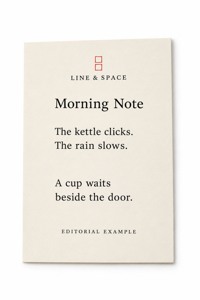
An existing digital version or plain handout may be sufficient. The linked custom postcards for an approved short-poem layout include a 4 × 6 inch vertical option, matching the portrait concept here. The listing identifies 16pt stock, a default glossy front and ordering increments of 50. “16pt” here describes stock thickness, not the size of the poem’s letters.
Compare custom postcard formats for other text layouts, and confirm the selected format and artwork with DecentCustom. The small image is an AI concept of the original editorial poem, not evidence of a finished print order.