Choose a green you can approve for the actual printed item. A screen preview, a CMYK label and an AI mockup each tell you less than a confirmed output workflow and an appropriate proof.

A vivid screen green may be outside the intended print gamut
Some highly saturated greens visible in RGB artwork cannot be reproduced the same way by a particular CMYK print condition. Converting the file can change that green; simply increasing its saturation again does not establish that the press can reproduce it.
Adobe’s commercial-printing guidance explains that RGB-to-CMYK conversion depends on an output profile and that bright greens can shift. This does not mean every green will change visibly, or that every printing provider wants you to convert the file yourself.
For a St. Patrick’s Day design, decide what “green” must mean. A flexible seasonal accent and a tightly controlled existing brand color are different requirements. Write that distinction into the request before choosing a dramatic screen color that you may later be unwilling to change.
Ask for the required file workflow before converting
The same Adobe guidance says a print provider may request profiled RGB, CMYK or PDF/X files. Follow the requirements for the selected job. A file labelled “CMYK” does not by itself identify the intended press, paper and conversion conditions.
Keep the editable original. Ask whether you should supply the existing profiled artwork or make a specified conversion, and ask which output profile or template applies if conversion is required. If those details are unknown, do not choose an unrelated profile merely to make a warning disappear.
For the shop owner, the practical question is: “What file will you interpret correctly for this selected product?” It is more useful than asking a designer to make the green look identical on every phone and printer. Confirm the actual stock and finish at the same time rather than treating every postcard configuration as the same job.
A gamut warning identifies a question, not an approved color
For a designer using Photoshop, Adobe’s gamut-warning instructions specify choosing the intended output profile through View → Proof Setup, then using View → Gamut Warning. The highlighted pixels identify colors outside that profile’s gamut.
If the green logo is highlighted, discuss an alternative color or the provider’s available production options. If it is not highlighted, that alone does not establish an exact physical match. The result is relative to the chosen profile, not an approval from the printer. A guessed profile can answer the wrong question.
A soft proof remains an on-screen simulation. When a physical color match is important, ask which proof or sample options are available for the selected job and what they represent. Confirm any cost and timing before deciding; do not assume a free production sample or a special fluorescent ink is included.
Worked choice: essential neon effect or flexible seasonal accent?
Verdant Line is a fictional shop designing a cream postcard with dark green geometric branding and a seasonal greeting. Suppose an early screen concept instead uses a fluorescent-looking green. The owner has two useful choices.
If that luminous effect is essential: pause approval and ask whether the selected production method can achieve it, with what evidence and at what cost. If it cannot be confirmed, keep that version digital or choose a different design. Do not approve a process-color approximation while still expecting a guaranteed fluorescent result.
If green is a flexible seasonal accent: work with the designer and provider on an acceptable alternative for the confirmed output conditions. Review the shop name and greeting at the actual card size too. A more reproducible color is not useful if the revised text is difficult to read.
The dark green shown in our AI concept is an illustration of a design direction. It is not a recommended ink formula or evidence that this exact displayed shade has been matched on the linked product.
A print request that states the unresolved decision
We are preparing a 6 × 4 inch St. Patrick’s Day postcard. The current green is a flexible seasonal accent, rather than an exact-match brand-color requirement.
Please confirm the selected stock and finish, the file format and embedded-profile requirements, and whether we should supply our existing artwork or convert it using a specified output profile.
Before approval, please explain any expected limitation on the proposed green and which proof or sample options are available, including what they represent, cost and timing. Please do not treat the AI concept image as a production color reference.
For an exact brand-color requirement, replace the first paragraph with your actual approved reference and required matching conditions. Do not reuse the “flexible” wording. Approval should state which artwork and proof were accepted and which production configuration they apply to.
Choose a postcard format after defining the color requirement
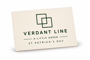
The linked custom 6 × 4 postcards for a seasonal design list 16pt stock and a default glossy front. The page shows ordering increments of 50; confirm the actual quantity and configuration. These specifications do not establish an ICC profile, a special ink or an exact color-match service.
Compare custom postcards in other sizes when the layout needs a different format, and confirm the actual file and color requirements with DecentCustom. If a digital greeting already meets the need, printing a new piece is optional.