A green icon is not automatically a shamrock. Count its leaflets, decide what the symbol should communicate and review the actual printed size before approving a seasonal design.
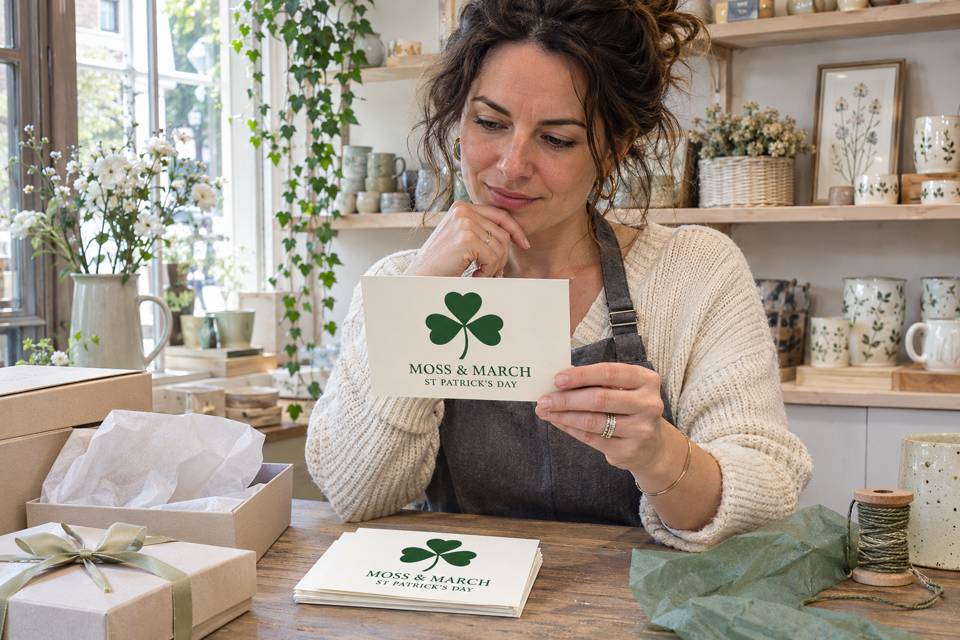
Use a three-leaflet shamrock for the traditional symbol
For a traditional St. Patrick’s Day shamrock design, specify three leaflets and a separate stem. A four-leaf clover is a different graphic. If your campaign deliberately uses four leaflets, keep that choice explicit rather than labelling the image a three-leaflet shamrock. Neither a green color nor a holiday headline resolves the distinction.
Teagasc’s Growing Wild: Shamrock describes the three-leaflet form and explains that several plants have been used as shamrock. The name does not establish one exclusive botanical species. A stylized printed icon should not be used to identify a living plant.
For artwork, count the separate leaflet shapes around the center, excluding the stem. In the Moss & March concept, one leaflet points up, one left and one right; the stem points down. At a glance, a large central overlap can hide the separation. Ask the designer to preserve a clear outline at the intended print size rather than relying on how a large screen preview looks.
A four-leaf image is not automatically an unusable seasonal illustration. It simply answers a different visual brief. If you want that graphic, name it accurately in the working file and accompanying copy. Do not give the designer two contradictory instructions such as “traditional three-leaflet shamrock” and “keep the four leaves in the reference.”
Separate cultural tradition from claims about your product
The National Museum of Ireland’s St. Patrick collection account discusses the March 17 feast day and its customs. It identifies the familiar explanation connecting the shamrock with the Trinity as a relatively late tradition. Present it as a tradition rather than proof that the historical St. Patrick demonstrably used this exact teaching method.
A shop does not need a historical claim to make a useful card. A simple seasonal greeting and the shop’s own name can be enough. The symbol alone also does not establish that a product was made in Ireland, approved by an Irish institution or connected to a local parade. Keep any origin, partnership or event statements separate and support them with the appropriate facts.
Decide whether the message is a greeting, an invitation or information about an actual offer. If it is only a greeting, do not add an invented event date, discount or booking instruction to fill space. This keeps the artwork brief short and prevents a decorative seasonal card from becoming a misleading promotion.
A complete postcard brief for a small gift shop
Moss & March is a fictional gift shop preparing a seasonal greeting insert. The owner wants a card that customers can read after opening a purchase. The existing box and protective wrapping stay in use; a printed postcard is not a substitute for protective packaging.
Project: Moss & March seasonal greeting, artwork version 01.
Format: a flat 6 × 4 inch landscape postcard, with a cream background and a dark green graphic and lettering.
Front copy: “MOSS & MARCH” and “ST PATRICK’S DAY”.
Symbol: our own stylized shamrock with exactly three clearly separate leaflets and one stem. Use no official logo or third-party artwork.
Purpose: a greeting insert only. No event, sale, Irish-made claim or institutional endorsement is being advertised.
Approval: the owner reviews the final-size front and any proposed reverse before the order is confirmed. Do not assume that a blank reverse or additional printing is included without checking the selected configuration.
This is a usable starting brief, not a press-ready file specification. Ask the printer for the actual artwork template, required image resolution, trim and safe-area instructions for the chosen configuration. Keep important text and the symbol inside the specified safe area. Do not invent a universal bleed measurement or assume every product accepts the same file setup.
Worked proof review: what to reject and what to approve
Suppose the first fictional proof has four heart-shaped leaflets around a center and the correct shop name. The owner should return a specific correction: “Version 01 does not match the brief. Replace the four-leaf graphic with three leaflets—top, left and right—with one separate stem below. Keep the shop name and seasonal wording unchanged.”
In version 02, check the correction at the actual 6 × 4 inch size. Count three leaflets again, read both lines without zooming and confirm that no letter or part of the stem runs into the safe-area boundary. A full-size desktop printout can help review scale and placement, but it does not prove the production paper, finish or exact printed green.
If a close brand-color match matters, ask which proof or sample options are available before approving production. Screen appearance and a home printer are insufficient evidence of the final color. The AI images here are visual concepts too, not production color references.
Record the approval against the corrected file, not a folder full of similarly named exports: “Moss & March version 02, front wording and three-leaflet symbol approved; selected format and production details confirmed separately.” If the designer later changes the symbol, wording or layout, review that new version. Counting the leaflets on an earlier proof does not approve a later export.
Use a postcard only when the insert has a purpose
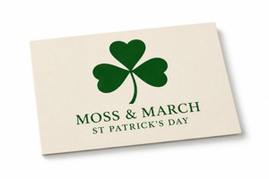
The linked custom 6 × 4 postcards for a seasonal insert list 16pt stock and a default glossy front. The current product page shows ordering increments of 50; confirm the actual quantity and configuration rather than treating that increment as a separately stated minimum order.
Compare custom postcards in other formats if the message needs a different layout. Send the approved artwork and actual requirements to DecentCustom before confirming production. No envelope, postage service or guaranteed delivery date is established by this example.
If an existing correctly labelled digital greeting already serves your customers, a new printed insert may add little. Choose the symbol and message first; choose additional materials only when someone has a reason to read or use them.